Reporting dashboard.
Analytics for extensive project needs
An intuitive dashboard empowering users to generate reports in minutes, not hours.
90%
Reduction in time required to produce reports
4x
Increase in reporting frequency per program tea
100%
Adoption by internal producers


Challenge.
Producers and clients struggled to visualise analytics, relying on exported spreadsheets, pivot tables, and manually built PowerPoint reports. They needed a visual reporting tool with filtering, editing, and export features to streamline insight sharing. Thorough research was key to success as we needed to compare the option to use third-party tools versus develop our own solution.
My role
Lead product designer Project manager
Success criteria
- Project teams can get access to relevant data instantly
- Customisable filtering for different programme needs
- Quick, visual report generation and export
Solution.
We designed a flexible, user-friendly reporting dashboard that included:
- Pre-configured widgets for key metrics (engagement trends, top content, top users)
- Clear, easy-to-read visual charts
- Intuitive filtering by user roles, regions, etc
- Comparative analytics across platform activities
- Date range selection
- One-click export to PDF or Excel
As the Lead Product Designer, I led the research, design, and delivery of the dashboard to replace manual reporting with scalable, visual insights.
Project delivery.
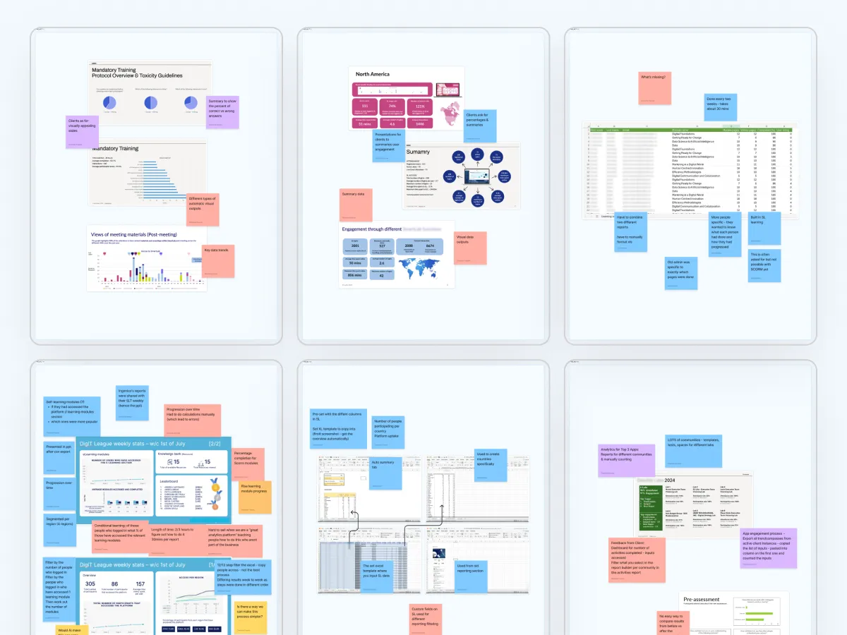
Uncovering reporting needs.
Interviews revealed major pain points. One producer spent 20+ hours on a single report, and a client found the current report builder difficult to use. In a workshop, producers shared real examples and prioritised features, helping us align the design with their workflows.
Project Highlight
Facilitated collaborative workshops to prioritise real-world needs, using card sorting to drive a user-centred requirements list.
Competitor and third-party tool analysis.
We analysed competitor dashboards and tested third-party reporting tools. While some solutions offered useful features, they required excessive adaptation, making an in-house solution the best fit for our specific use cases.
This drove build-vs-buy analysis, evaluating third-party solutions and advocating for a tailored in-house experience that better fit user needs.

Key leadership moment
The direct collaboration with users ensured the dashboard delivered real value and aligned closely with user priorities. Considering the requirements, I advocated the analysis of third-party tools defining an in-platform solution as the best option to meet both business and user needs.

Concept design & early feedback.
We began with quick sketches and low-fidelity concepts to explore layout and interaction models. Early feedback revealed areas for refinement: presets introduced too many choices, the setup process still felt overly manual, and users found it difficult to see what dataset options were available. These insights helped us focus on simplifying choices in the next design iteration.

Design and prototyping.
Using the platform’s established design system, we created high-fidelity mockups that maintained consistency with the existing user interface. We explored options for widgets that grouped engagement, consumption, and audience data logically.

Project Highlight
Used design system components strategically to accelerate high-fidelity prototyping and accelerate delivery.
Testing & feedback.
Unobserved testing.
Using UseBerry, we imported Figma prototypes to track heat maps and first impressions. Users found the main controls intuitive and easy to use. Overall, feedback was positive, with many stating that the dashboard met their reporting needs effectively.

Observed testing.
Producers explored the prototype while voicing their thought process. This revealed deeper workflow insights, validating ease of use while highlighting areas for improvement.
Key areas for improvement
- Filtering: Improve advanced filter visibility avoiding unnecessary widget-level filters.
- Labels: Clarify terms like "Interactions" and "Content," and refine date formats.
- Exporting: Allow pre-export filter confirmation, multi-widget selection, and format options (PDF/Excel).

Key leadership moment
The dashboard needed to handle complex datasets without overwhelming users. Iterative design sessions with producers helped to simplify data presentation, prioritising clarity and actionable insights.

Design updates.
Following testing, we iterated the design. Testing a new prototype with the original focus group and additional users.

Improved: Clearer and more accessible filters for full dashboard.

Improved: Filters sticky on scroll for accessibility.

Improved: Advanced filters with granular control of audience.

Improved: Easier access to set timeframe and custom date range

Improved: Options to show/ hide unused widgets.

Improved: Export panel to conform document type and filters.
Launch & impact.
Development & data validation.
All interactions were thoroughly documented to support smooth developer collaboration.
I worked closely with development and QA teams to validate data accuracy. We defined clear expectations for each widget and cross-checked outputs against real datasets, ensuring that filters and visualisations were not only functional but trustworthy.

Project Highlight
Maintained close collaboration across design, development, and QA ensuring sprint-based delivery and quality assurance stayed aligned with evolving requirements.
Beta lanuch.
The reporting dashboard significantly reduced the time producers spend creating client-facing reports from 20+ hours of manual work down to just minutes using pre-configured visual outputs and one-click exports. Internal users reported faster turnaround times, fewer data accuracy issues, and increased confidence in sharing reports with stakeholders.
Early feedback from beta users highlights improved clarity, smoother workflows, and increased engagement with platform analytics. Producers now have a reliable, scalable way to generate professional-quality reports quickly, supporting faster decision-making across client teams.
Key Contributions
- Led the design and delivery of a flexible in-platform reporting solution
- Facilitated user research and workshops to shape the MVP
- Advocated for an in-house solution over third-party tools to better match user needs
- Guided iterative testing and refinement of complex data interactions
- Aligned design, dev, and QA across a fast-paced delivery timeline
Key metrics
90%
Reduction in time required to produce reports
4x
Increase in reporting frequency per event team
100%
Adoption by internal producers within the first month


